Author Archives: Rick Ladd

About Rick Ladd

Unknown's avatar
I retired over14 years ago, though I've continued to work on and off since then. Mostly I'm just cruising, making the most of what time I have remaining. Although my time is nearly up, I still care deeply about the kind of world I'll be leaving to those who follow me and, to that end, I am devoted to seeing the forces of repression and authoritarianism are at least held at bay, if not crushed out of existence. I write about things that interest me and, as an eclectic soul, my interests run the gamut from science to spirituality, governance to economics, art and engineering. I'm hopeful one day my children will read what I've left behind.

A Day With Edward Tufte

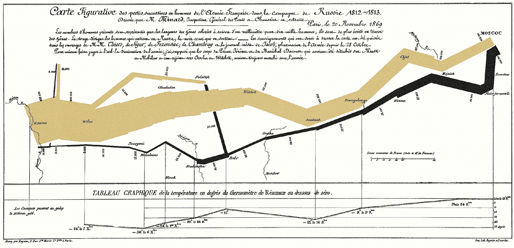
Graphic of Napolean's March

One of the more iconic images Professor Tufte uses in his presentations. I have a mounted, autographed poster of this one.

If you create reports, presentations, info graphics, or are in any way involved with presenting data of any sort, I hope you’ve heard of Edward Tufte. Even better if you’ve heard of his work, especially what I believe is his seminal book, “The Visual Display of Quantitative Information.”

As part of my job at Rocketdyne, I was privileged to attend an all-day seminar of his in Los Angeles in the Spring of 2007 or ’08. Upon my return, I wrote down some notes and impressions for my colleague who paid for the day. There’s some really good stuff in here. As a knowledge management professional, I’m a bit chagrined it’s taken me this long to share it. I truly hope someone finds Tufte’s words useful.

Bill:

Here’s a quick recap of Edward Tufte’s presentation last Thursday. What I did, for the most part, was enter points he made as numbered bullets. Therefore, I’ll do the same here with the addition of some extra comments if I feel they are necessary.

1. Professor Tufte refers to the nature of the work he does as “escaping flatland”. He believes dimensionality is extremely important when using visualization to represent quantitative data.

2. Another aspect of visually presenting data which he emphasizes is data density, i.e. resolution. He repeatedly stressed the need to drive for greater and greater resolution when presenting data.

3. With respect to items such as run charts, histograms, etc., he believes it is far better to label the data directly, avoiding the use of keys, which he feels are distracting.

4. He presented a copy of Euclid’s Elements, which included many “pop-up” graphics used to illustrate his points. The copy of the book he had an assistant bring around (wearing white gloves) for us to view is 432 years old. It was awesome just to see it. He refers to these pop-ups as the “brute force” method of escaping flatland.

5. A key point he stressed is to enforce visual comparisons. The terms he used (should sound familiar) were, “it depends” and “compared to what?”.

6. The visual representation of data should show mechanism, process, or dynamics, i.e. they should present causality as an aide to understanding and clarity.

7. He also stressed the importance of showing more than 1 or 2 variables when preparing a chart.

8. Presentations must be content driven, i.e. they must embody the three elements of quality, relevance, and integrity. Integrity was a big theme of his and one I don’t believe most of us would find fault with.

9. Design can’t rescue failed content, which he referred to as “chart junk”. This is another point which relates to integrity, and one which he continually stressed throughout his presentation.

10. Whether it’s drawing or words, it’s all information. Don’t be afraid to use words to make your point.

11. I’m not entirely certain of what he meant by this point, but what I wrote down was the following: “Better to show info adjacent in space as opposed to stacked in time.”

12. He stressed that you should use small multiples, i.e. strive for high resolution of the data.

13. Another point which he used to continue driving home the importance of integrity was to show the whole data set. At the same time he stressed that one need not show the zero point, i.e. context is what’s important in making a useful, accurate presentation.

14. Detail does not mean clutter. If you can’t present your data in sufficient enough detail without making it difficult to understand, rethink your design; it’s probably faulty.

15. When presenting data always normalize, adjust, and compensate to provide greater clarity and integrity. The example he gave for this involved a situation where it was impossible to know the real changes in costs of consumer items without taking into consideration the rate of inflation over a period of time. Absent this adjustment, the changes appeared to be far greater than they actually were.

16. Perhaps this next point was specific to financial charts, but it seems appropriate for many others. Don’t trust displays which have no explanatory footnotes. Generally speaking, Tufte believes one should annotate everything. His philosophy appears to be to always err on the side of accuracy and completeness (see integrity).

17. He made a point of explaining the human mind’s tendency to remember only the most recent (recency bias) data it perceives. I don’t remember the exact context in which this statement was made, but I think it is related to Ed Maher’s assertion that we tend to focus on the out-of-family (I can’t remember the exact phrase he used) experiences rather than the steady state.

18. He used a word I thought was interesting to describe people who create fancy charts which don’t actually say much – “chartoonist”.

After going into some detail regarding how the Challenger disaster occurred or, more accurately, how it was allowed to happen, he suggested there were three moral lessons to be learned from the experience. He posed these lessons in the form of three questions one must ask oneself when producing information of this nature.

1. Where is the causality?

2. Is all relevant data included?

3. What do I really need to see if I’m going to decide this?

He guaranteed if these three questions were adequately addressed, the chance of getting the decision right were greatly increased.

He then went on to lay out a list of rules for presentations, as follows:

1. Get their attention (he gave an example of what he called the “stumblebum” technique, where a presenter purposely made a mistake – which the audience was more than happy to point out – in order to insure everyone was paying attention (presumably to see if they could catch him again; which they never did.) He made a point of suggesting this probably wasn’t the best technique, unless you’re really good.

2. Never apologize – don’t tell the audience how you didn’t sleep well the night before, etc.

3. PGP – Start with the particular, move to the general, return to the particular.

4. Give everyone at least one piece of paper; something tangible they can leave the room with.

5. Respect your audience’s intelligence.

6. Don’t just read from your charts.

7. Forget K.I.S.S. – Be thorough and accurate, not simple and vague.

8. He stressed the importance of humor, something he was excellent at. He did caution appropriate use (duh?).

9. If you believe what you’re presenting, make sure the audience knows it.

10. Finish early

His final points to improving one’s presentations were directed to the presenter and the presentation, respectively. The first point was to practice or rehearse so the presentation goes smoothly and you are able to get through it without stumbling or going over your allotted time. The second was to have better, stronger content.

Professor Tufte’s presentation was extremely engaging, from my point of view. He knew his stuff and made it interesting, fun, and funny. I confirmed that most of what he discussed is contained in one or more of the three books I took from the seminar, and I’m looking forward to reading again what I think I learned from him. Much of what he had to say was common sense, which I have encountered previously from the years I’ve spent putting together presentations. Nevertheless, I believe he had a great deal to offer which will ultimately improve my ability to present information, whether in a briefing or on a web site. I really enjoyed seeing and listening to him. Thanks for the opportunity.

Rick


When The World Almost Ended


Drop Drill

Drop Drills Were Part of School Life

 The Cuban Missile Crisis came up in a short conversation I had with my 14-year-old daughter yesterday. She knew little about it but was somewhat aware of the Cold War. 

The conversation, however, reminded me of several things that haven’t crossed my mind in a while. The first memory was of walking to a Dale’s supermarket in Panorama City, California where I lived in the 50s and where one of my best friends continued to live. 

I was 15 and he had turned 16 that year, so we may have driven, though I doubt it. What I do remember is the empty shelves, most all of the food having been scooped up by people expecting the end of the world. It was eerie. 

The other thing that popped into my mind was the frequent drop drills, which I suspect is similar to how kids today are trained to react in case of an earthquake. In retrospect, I find it amusing we were taught that crawling under our desks could protect us from a thermonuclear detonation nearby. Back then, there were lots of targets nearby, not the least of which was Rocketdyne, where I have worked most of the last three decades. 

Finally, I had long forgotten the monthly air raid siren drills. Once a month – as I recall, it was on the third Thursday – at 10:00 am, the sirens would blast for about a minute. Not sure when it ended, but it had to be a long time ago. At this point I’m pretty sure most of my friends have no recollection of these drills, as they never experienced them. 


Program Management By Ouija Board

image

Going back to work after nearly five years of “retirement” has been both interesting and instructive. When I was asked if I would be willing to do scheduling, which is something I had done many years ago, I happily said “yes”. I would have probably agreed to almost anything they wanted me to do, as I was anxious to supplement my meager retirement income. Actually, I first learned scheduling software using a mainframe tool called Artemis. Shortly afterward, we were introduced to a PC version of Artemis which, if memory serves, was called Schedule Publisher and, within another very short period, it was spun off into a product from Advanced Management Solutions, called AMS REALTIME Projects.

This was somewhere around 1994 and, at the time, Microsoft Project was comparatively bare bones and nowhere near as useful (in my opinion at the time) as REALTIME Projects. Having long been very much a visual person, I find the visualization provided by Gantt charts to be particularly useful when looking to see how the logic in a schedule affects downstream activities as time, and the work contemplated in the schedule, moves forward. Until Project introduced the Timeline view, which allows quick zooming and panning, I was not terribly happy with it compared to the AMS product, which offered a useful timeline capability.

So . . . since I had done scheduling for a few years during the 90s, I readily accepted the challenge and, upon my return on January 19, 2015, I was amused to see the company was still using Project 2002 which, although newer than the version I had struggled with, was still well over a decade old. The main reason for this, I was told, was because a set of macros had been developed over the years that allowed schedules to be matched up with the organization’s earned value management system, which is Deltek MPM.

Unfortunately, using such an old piece of software presented some interesting problems. One of the most egregious, from my point of view, was its inability to run in any of the conference rooms in my building. This was — and still is — due to an IT rule put in place that won’t run software in conference rooms if it’s more than two versions older than the most current one available. In the case of MS Project, the latest version available when I returned was 2013. Also, MS had released a 2007 and a 2010 version, which put the one in widespread use more than two versions behind and, as a result, clicking on the tool (which was installed in all the conference rooms) invoked Project but, instead of seeing the tabular data alongside a Gantt chart, all one got was an empty box with a small red “x” in the upper lefthand corner.

In my experience, scheduling is an activity that absolutely must be done collaboratively. A good, useful schedule requires (at the very least) a great deal of understanding of not only the work to be done, but the ways in which the logic of its progression needs to be modeled in order to accurately reflect how downstream activities are impacted by small changes as work progresses . . . and changes are absolutely unavoidable, especially in large, complex projects such as rocket engine design, manufacture, and test.

Since it was impossible to use the tool in a conference room, where I could sit with the Program Manager, one or more Control Account Managers, and various Engineers (Design, Quality, Manufacturing, etc.) developing schedules became somewhat difficult and inordinately iterative, requiring dozens of communications back and forth between me and the Program Manager, as well as others who we needed input from. As work progressed, I was able to get IT to agree to allow me to log into my computer remotely from any one of the conference rooms, which made working on the schedule much easier. However, the resolution in the conference rooms was far less than that available to me on my Dell all-in-one. Its screen is 23″ diagonally, plus I have an extension display that gives me another 19″ off to the side. What I see on screen in conference rooms is not as inclusive as what I normally work with and it takes a bit of adjusting, which cuts into the speed with which I can get things done.

As I both refamiliarize myself with the scheduling process and learn how the tools have advanced, I’m learning a lot about how best to do it. Perhaps more importantly, I’m also learning how little most people know of the power of a good piece of scheduling software. There are people here who still use Excel spreadsheets and date functions to create schedules. Maybe I’m missing something, but MS Project and other similar tools provide not only calendaring functionality, but also the kind of logic necessary to accurately model the interplay between design, quality, procurement, operations, testing, and numerous other ancillary and important processes that make up the entirety of a program.

Inasmuch as Project also provides for highly detailed resource loading (quite literally down to the gnat’s ass, if one is so inclined), I’m unclear as to why we don’t use it for at least first cut proposal activity. Were we to do so, I’m convinced it would not only speed up the initial process of pricing a decent proposal but, when completed, there would be no need to then create a schedule from scratch, which is generally the way it’s done now. I suspect there are some people out there who actually do what I’m suggesting but, for all I know at this point, my perception could be wildly innacurate.

So . . . I’m kind of hedging my bets and, while I’m agitating for people to consider using MS Project more widely and for deeper resource planning, I’m mostly looking to understand the tool a little more each day. It, like many tools available to organizations of all kinds and sizes, is far more powerful than most individuals understand or are interested in learning. I’m constantly finding myself believing we are crippling ourselves by not using it far more extensively but, as many have pointed out, changing direction in a reasonably large organization, especially one which depends largely on government contracts and oversight, is like turning an aircraft carrier with a canoe paddle. On the bright side, it could keep me working for another decade, the prospect of which does not bother me in the slightest.


Donald J. Drumpf – Your Drunk Neighbor

Based on recordings of things Teh Donald™ has actually allowed to plummet out of his fabulously wealthy piehole, this video pretty much sums up many (not all, but many) of my feelings about the man and his followers. I understand the fear some white people feel, though I think it’s ridiculous of them to do so. I’m pretty sure what really scares them is the realization of how terrible people of color have been treated and, since they’re so good at projection, they’re assuming white people are now going to get as good as they gave.

As a straight, white male I really do understand what many of them feel. However, as one who works hard to understand others, and who believes empathy is an important tool for anyone who wishes to live in a reasonably civilized, respectful, and well-adjusted society, I am of the opinion they’re making things worse for everyone, including themselves.

So . . . here it is folks. I can hardly think of a better way to characterize the blatherings of our first reality show presidential candidate. This is YUGE!!


Testing My Universal Mobile Keyboard

image

I took my 12-year-old to check out computers the other day and, after we looked at a few, I decided what to get her. Then I made a kind of an impulse buy and got myself a Samsung Galaxy Tab4 which, at the price they were charging, was almost free. Anyway, I got it yesterday (they didn’t have any in stock, so they had to ship me one) and spent a bit of time figuring it out and loading a few apps from the Play Store.

When I got to work today, I realized I had my universal mobile keyboard, which was designed to be used with phones and notepads. I had installed the WordPress app, so I thought I would give it a try and post this short note to see how it felt. I’m loving the Galaxy Tab4 and intend on using it to watch Netflix, which I also installed, post to my blog (tada), and probably read with the Kindle app, which I’ve yet to install. Think I’ll do that after I post this. I also need to get a sim card, as there’s only about 8Gb of addressable memory in this thing. Amazon Prime, here I come.


Cinnamon and Coconut Glazed Donuts!

Sure look good, donut they?

Staying reasonably faithful to a diet that’s both fulfilling and healthful is made difficult here at work. Whenever there’s an event that involves food – and there are lots of them – it is set out on a group of lateral filing cabinets that are just a few feet from me. In fact, of the one hundred or so people on the floor, I’m the closest to the food.

Today, someone brought in at least five dozen donuts. I resisted successfully, but I would prefer avoiding the “near occasion of sin” where possible. Still, I cleared the hurdle, and I’m continuing my quest to drop down to 165 lbs. by my 69th birthday in early June.


Is It Too Late For Me?


Guy on Bike

Got to Keep on Truckin’

Lately I’ve found myself wondering if it’s too late for me to have a mid-life crisis. Maybe, if 70 is the new 50, the time is just about nigh. I’ve never had one and I’m thinking I may have missed out.


Please Forgive My Selfish Indulgence

I was just going through some of my PowerPoint files, looking for one very specific file in which I’ve gathered many of the great, useful graphics (like this) Dion Hinchcliffe has created over the years. As I was searching I came across a program I put together for my mother’s funeral, which will have been eleven years ago this coming March 5.

Annette Ladd

My mother at about 18 years old. This is one of the pics I used for her funeral program

Maybe I’m just an emotional pushover, but the realization she’s been gone over a decade, that my father has been gone for over thirty years, and lots of people my age are dropping had me feeling pretty melancholy right now. I wept, but I’m not sure why. I don’t generally feel sorry for myself, but I think I was lamenting something we all go through; the loss of our childhood, our innocence, our loved ones.

Actually, the feeling is both bothersome and cathartic. I’ve always felt being in touch with one’s emotions — and giving vent to them on occasion — is both healthy and empowering, but I must confess to feeling a bit guilty expressing them in public like this. Nevertheless, it’s one of the reasons I have this blog. I’ll get over it.


I Swear I Was Stone Cold Straight

I had one of those timeless moments this evening. I was on my way to pick up my vehicle, which needed some work due to a safety recall. The Honda dealership was kind enough to provide me with a creature comfort-laden Nissan Pathfinder, which I happily drove to work from the Enterprise office, and was to return to the Honda dealer, where I was headed, on the way home.

I had just exited California 118 (the Ronald Reagan freeway) at 1st Street in Simi, turning south to the dealership about a quarter mile away. As I was crossing over the freeway, the light was red and I was stopped at the apex of the arched overpass. The entire perimeter of the sky was filled with soft pink clouds, and there was a long golden streamer of cloud radiating eastward, driven by the last rays of the setting Sun. As I looked from west to east, the clouds and the edges of the sky faded from a bright to a soft pastel pink.

In the sky to the east hung an almost full Moon, its glow softened by a thin layer of clouds, and to the West a long, steady stream of vehicles moved steadily toward their destinations, their headlights forming a brilliant necklace of light. I wanted to take a picture, but a panorama would have taken time I didn’t think I had. I looked through hundreds of pink sunset pictures I googled, hoping to find something at least evocative, but nothing felt right, so I have nothing but my memory . . . and the experience.

The whole moment lasted about 10 seconds, but it was extraordinarily beautiful and felt timeless. It wasn’t all that different from some other similar experiences; after all, it was just a sunset, the Moon (yawn), and moderate freeway traffic, yet it felt eternal (for a moment 🙂 ). Weird, huh?


Dying Ain’t What it Used to be.

Funny how one reacts at the news of the deaths of famous and beloved people. David Bowie was less than five months older than me. Natalie Cole about two and a half years younger.

I don’t think I’m overly obsessed (is that from the Department of Redundancy Department?) with death, but anyone who reads this blog knows I do think of it. I believe I’m driven to contemplate it by two major factors in my life: my father’s untimely death at a couple months shy of his 60th birthday, and; my becoming a first-time adoptive father at 55 and again at 59.

Since I’ve long passed the age at which the old man died, I believe the “sword” hanging over my head is related to my desire to be around long enough to get to know both my daughters when they’re adults. My oldest will be 15 this year and she’s not terribly interested in anything I have to say, and I’m anxiously awaiting the 12-year-old’s descent into madness.

Pile on top of that the numerous ways in which my body is aging, changing, and falling apart, and I hope to hang on for at least another decade before shedding this mortal coil and rejoining the great quantum field from whence we’ve all emerged. Also, the changes in technology and society that are taking place right now have me wishing I could live another hundred years or so — just to see what happens!

I’m well aware the ultimate trajectory of my existence is mostly out of my control . . . and I’m fine with that. I’m quite certain when it’s my time I’ll be ready if it takes a while and I’m aware of the end’s approach, or there won’t be any me to worry about it. I just don’t want my kids to lose their third father before their twentieth birthdays. They deserve better.