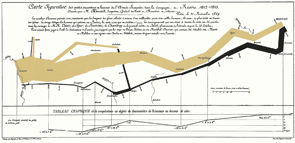
One of the more iconic images Professor Tufte uses in his presentations. I have a mounted, autographed poster of this one.
If you create reports, presentations, info graphics, or are in any way involved with presenting data of any sort, I hope you’ve heard of Edward Tufte. Even better if you’ve heard of his work, especially what I believe is his seminal book, “The Visual Display of Quantitative Information.”
As part of my job at Rocketdyne, I was privileged to attend an all-day seminar of his in Los Angeles in the Spring of 2007 or ’08. Upon my return, I wrote down some notes and impressions for my colleague who paid for the day. There’s some really good stuff in here. As a knowledge management professional, I’m a bit chagrined it’s taken me this long to share it. I truly hope someone finds Tufte’s words useful.
Bill:
Here’s a quick recap of Edward Tufte’s presentation last Thursday. What I did, for the most part, was enter points he made as numbered bullets. Therefore, I’ll do the same here with the addition of some extra comments if I feel they are necessary.
1. Professor Tufte refers to the nature of the work he does as “escaping flatland”. He believes dimensionality is extremely important when using visualization to represent quantitative data.
2. Another aspect of visually presenting data which he emphasizes is data density, i.e. resolution. He repeatedly stressed the need to drive for greater and greater resolution when presenting data.
3. With respect to items such as run charts, histograms, etc., he believes it is far better to label the data directly, avoiding the use of keys, which he feels are distracting.
4. He presented a copy of Euclid’s Elements, which included many “pop-up” graphics used to illustrate his points. The copy of the book he had an assistant bring around (wearing white gloves) for us to view is 432 years old. It was awesome just to see it. He refers to these pop-ups as the “brute force” method of escaping flatland.
5. A key point he stressed is to enforce visual comparisons. The terms he used (should sound familiar) were, “it depends” and “compared to what?”.
6. The visual representation of data should show mechanism, process, or dynamics, i.e. they should present causality as an aide to understanding and clarity.
7. He also stressed the importance of showing more than 1 or 2 variables when preparing a chart.
8. Presentations must be content driven, i.e. they must embody the three elements of quality, relevance, and integrity. Integrity was a big theme of his and one I don’t believe most of us would find fault with.
9. Design can’t rescue failed content, which he referred to as “chart junk”. This is another point which relates to integrity, and one which he continually stressed throughout his presentation.
10. Whether it’s drawing or words, it’s all information. Don’t be afraid to use words to make your point.
11. I’m not entirely certain of what he meant by this point, but what I wrote down was the following: “Better to show info adjacent in space as opposed to stacked in time.”
12. He stressed that you should use small multiples, i.e. strive for high resolution of the data.
13. Another point which he used to continue driving home the importance of integrity was to show the whole data set. At the same time he stressed that one need not show the zero point, i.e. context is what’s important in making a useful, accurate presentation.
14. Detail does not mean clutter. If you can’t present your data in sufficient enough detail without making it difficult to understand, rethink your design; it’s probably faulty.
15. When presenting data always normalize, adjust, and compensate to provide greater clarity and integrity. The example he gave for this involved a situation where it was impossible to know the real changes in costs of consumer items without taking into consideration the rate of inflation over a period of time. Absent this adjustment, the changes appeared to be far greater than they actually were.
16. Perhaps this next point was specific to financial charts, but it seems appropriate for many others. Don’t trust displays which have no explanatory footnotes. Generally speaking, Tufte believes one should annotate everything. His philosophy appears to be to always err on the side of accuracy and completeness (see integrity).
17. He made a point of explaining the human mind’s tendency to remember only the most recent (recency bias) data it perceives. I don’t remember the exact context in which this statement was made, but I think it is related to Ed Maher’s assertion that we tend to focus on the out-of-family (I can’t remember the exact phrase he used) experiences rather than the steady state.
18. He used a word I thought was interesting to describe people who create fancy charts which don’t actually say much – “chartoonist”.
After going into some detail regarding how the Challenger disaster occurred or, more accurately, how it was allowed to happen, he suggested there were three moral lessons to be learned from the experience. He posed these lessons in the form of three questions one must ask oneself when producing information of this nature.
1. Where is the causality?
2. Is all relevant data included?
3. What do I really need to see if I’m going to decide this?
He guaranteed if these three questions were adequately addressed, the chance of getting the decision right were greatly increased.
He then went on to lay out a list of rules for presentations, as follows:
1. Get their attention (he gave an example of what he called the “stumblebum” technique, where a presenter purposely made a mistake – which the audience was more than happy to point out – in order to insure everyone was paying attention (presumably to see if they could catch him again; which they never did.) He made a point of suggesting this probably wasn’t the best technique, unless you’re really good.
2. Never apologize – don’t tell the audience how you didn’t sleep well the night before, etc.
3. PGP – Start with the particular, move to the general, return to the particular.
4. Give everyone at least one piece of paper; something tangible they can leave the room with.
5. Respect your audience’s intelligence.
6. Don’t just read from your charts.
7. Forget K.I.S.S. – Be thorough and accurate, not simple and vague.
8. He stressed the importance of humor, something he was excellent at. He did caution appropriate use (duh?).
9. If you believe what you’re presenting, make sure the audience knows it.
10. Finish early
His final points to improving one’s presentations were directed to the presenter and the presentation, respectively. The first point was to practice or rehearse so the presentation goes smoothly and you are able to get through it without stumbling or going over your allotted time. The second was to have better, stronger content.
Professor Tufte’s presentation was extremely engaging, from my point of view. He knew his stuff and made it interesting, fun, and funny. I confirmed that most of what he discussed is contained in one or more of the three books I took from the seminar, and I’m looking forward to reading again what I think I learned from him. Much of what he had to say was common sense, which I have encountered previously from the years I’ve spent putting together presentations. Nevertheless, I believe he had a great deal to offer which will ultimately improve my ability to present information, whether in a briefing or on a web site. I really enjoyed seeing and listening to him. Thanks for the opportunity.
Rick